Where's the Goal Tracker?
Redesigning Goal Tracker for Budget Master
Role
UX Researcher
Skills
Persona Development, Usability Testing, Think-Aloud Protocol, Wireframing
Timeline
3 Weeks, Research — Wireframe Delivery
Context
Simulated client engagement (bootcamp)
Overview
This was a simulated engagement — the client, data, and constraints were provided by the program. Budget Master is a personal finance app with a newly launched "Goal Tracker" feature that lets users set savings goals, track debt payoff, and monitor progress over time. But early feedback and analytics showed the same thing: users found Goal Tracker confusing and hard to use, leading to low engagement and abandoned goals.
Through persona-driven usability testing with 5 participants drawn from four user segments, we identified 7 critical usability issues — including a Goal Tracker that users couldn't even find — and we delivered redesigned wireframes that simplified goal setup, improved discoverability, and introduced a shared goal feature. I structured the analysis and built the redesigned wireframes.
Who Are We Designing For?
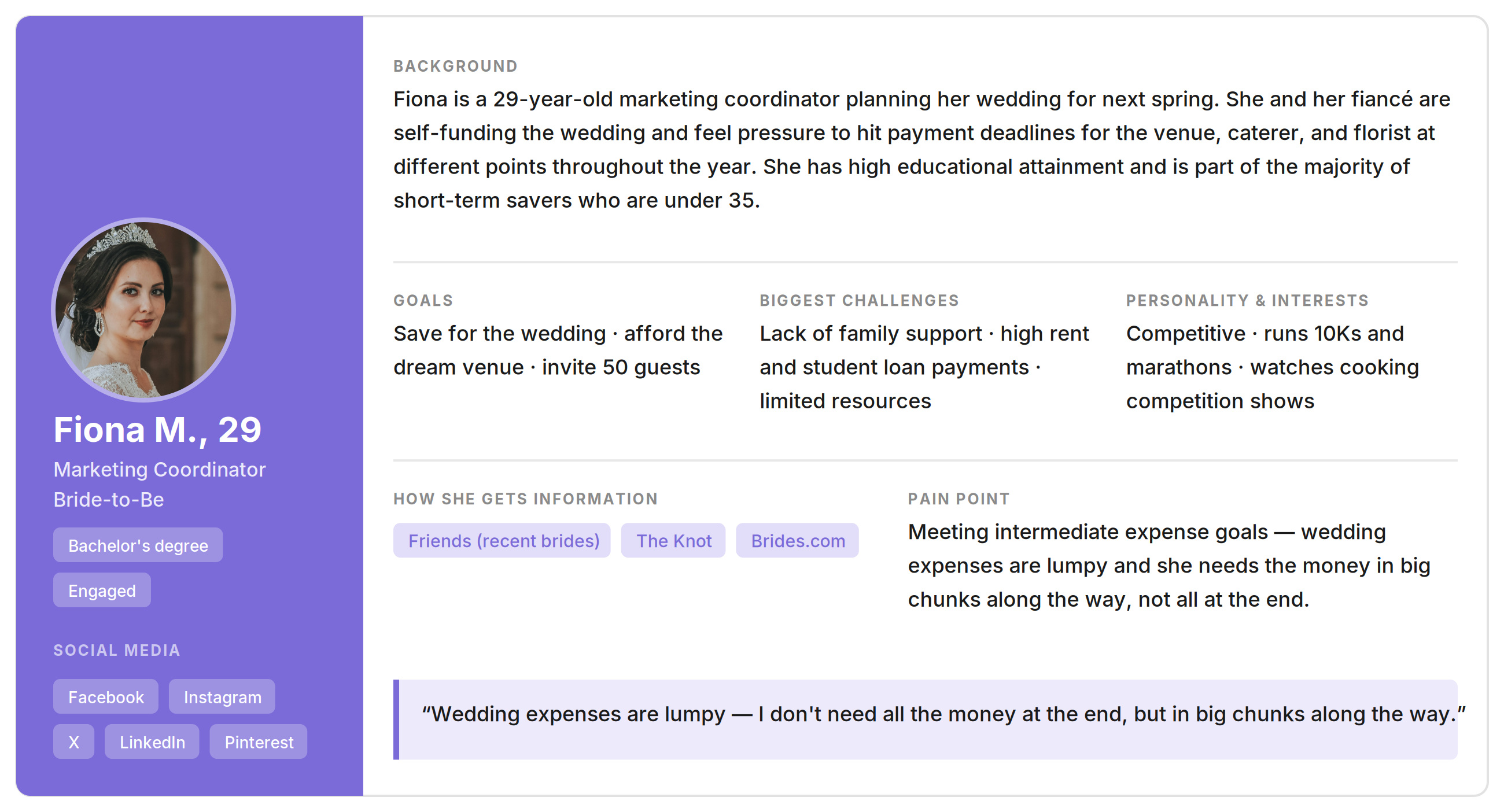
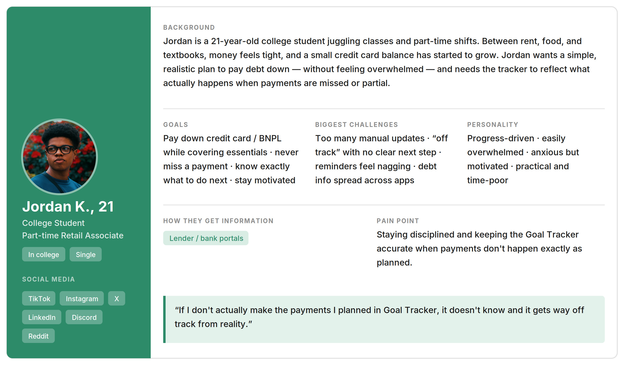
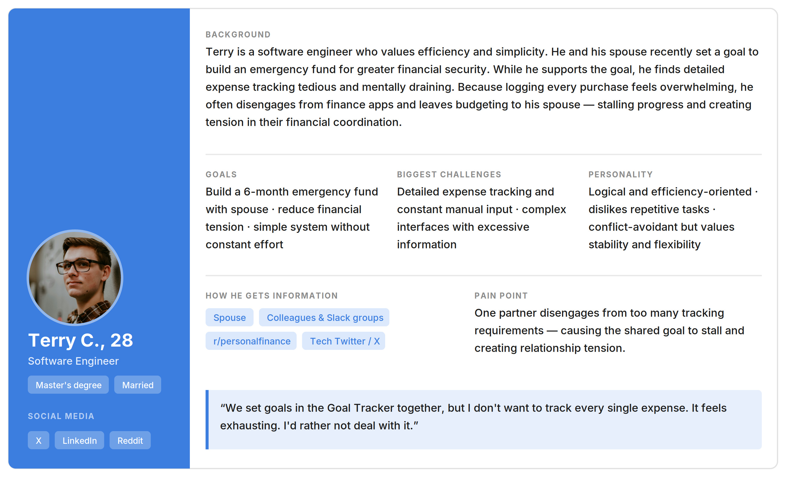
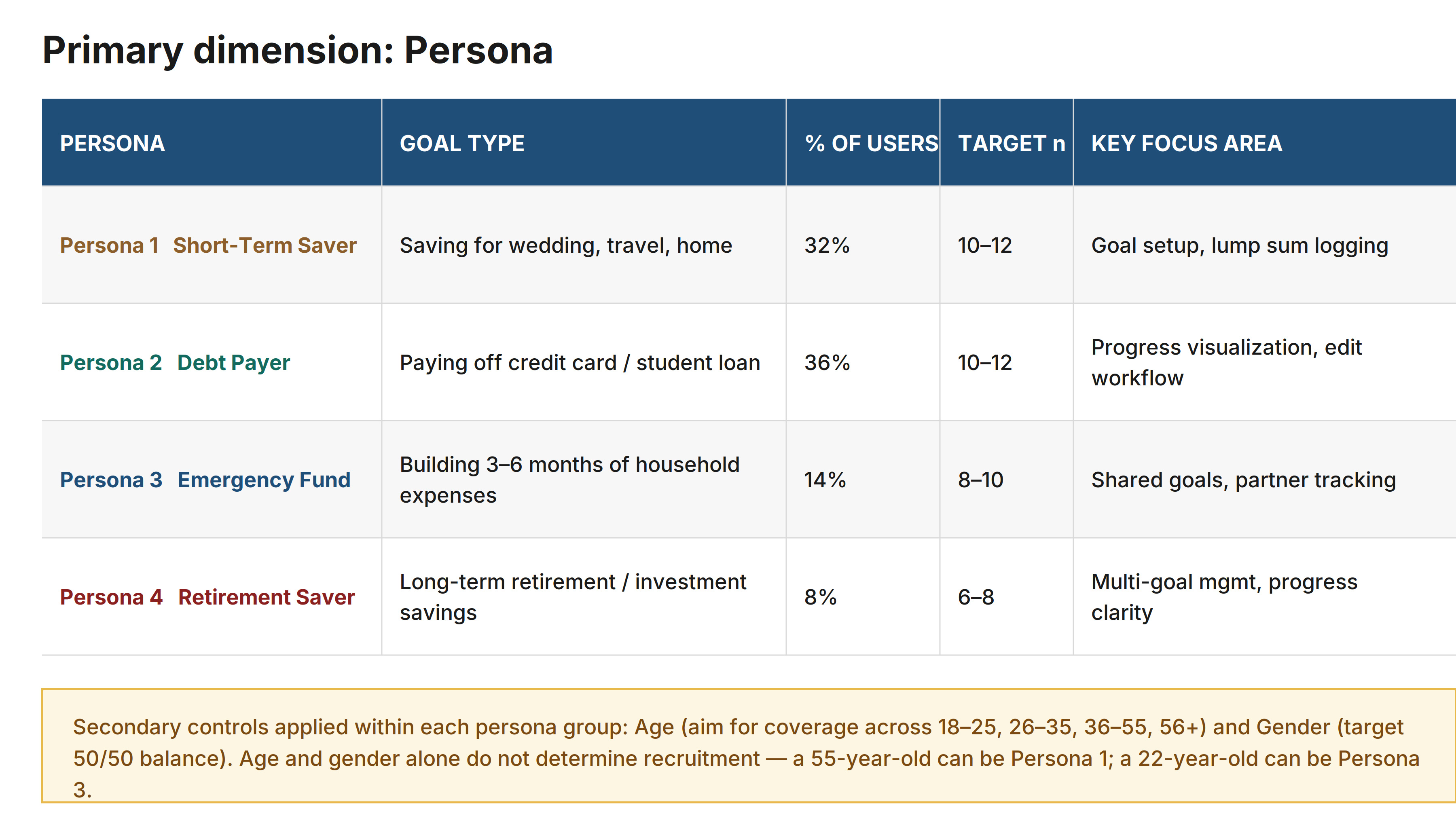
Before designing the usability test, we needed to understand who was using Goal Tracker and why. We analyzed existing user data and identified four distinct personas:
32%
Short-Term Saver
Achievement-oriented users under 35 saving for events like weddings. They need money at several points along the way, not just at the end.
36%
Debt Payer
College students or recent graduates paying off credit cards or student loans. Disengage when the tracker doesn't match reality.
14%
Emergency Fund Builder
Dual-income couples where one partner manages the tracking. Disengage when tracking requires constant manual effort.
8%
Retirement Saver
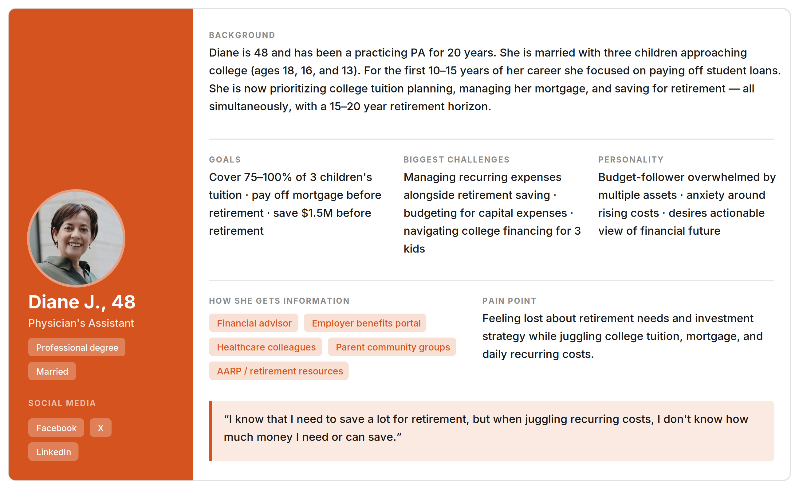
Mid-career professionals juggling tuition, mortgage, and retirement savings simultaneously.
Testing With Real Tasks, Real Frustration
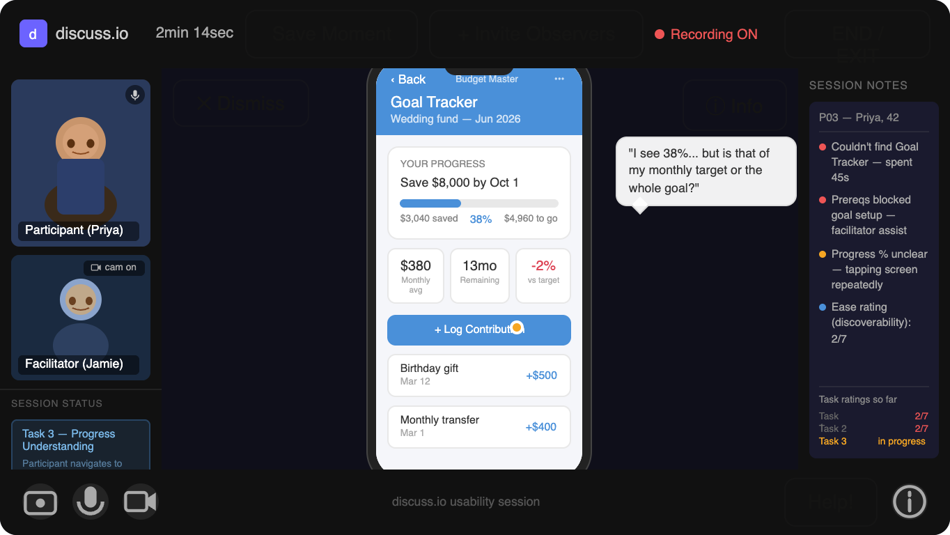
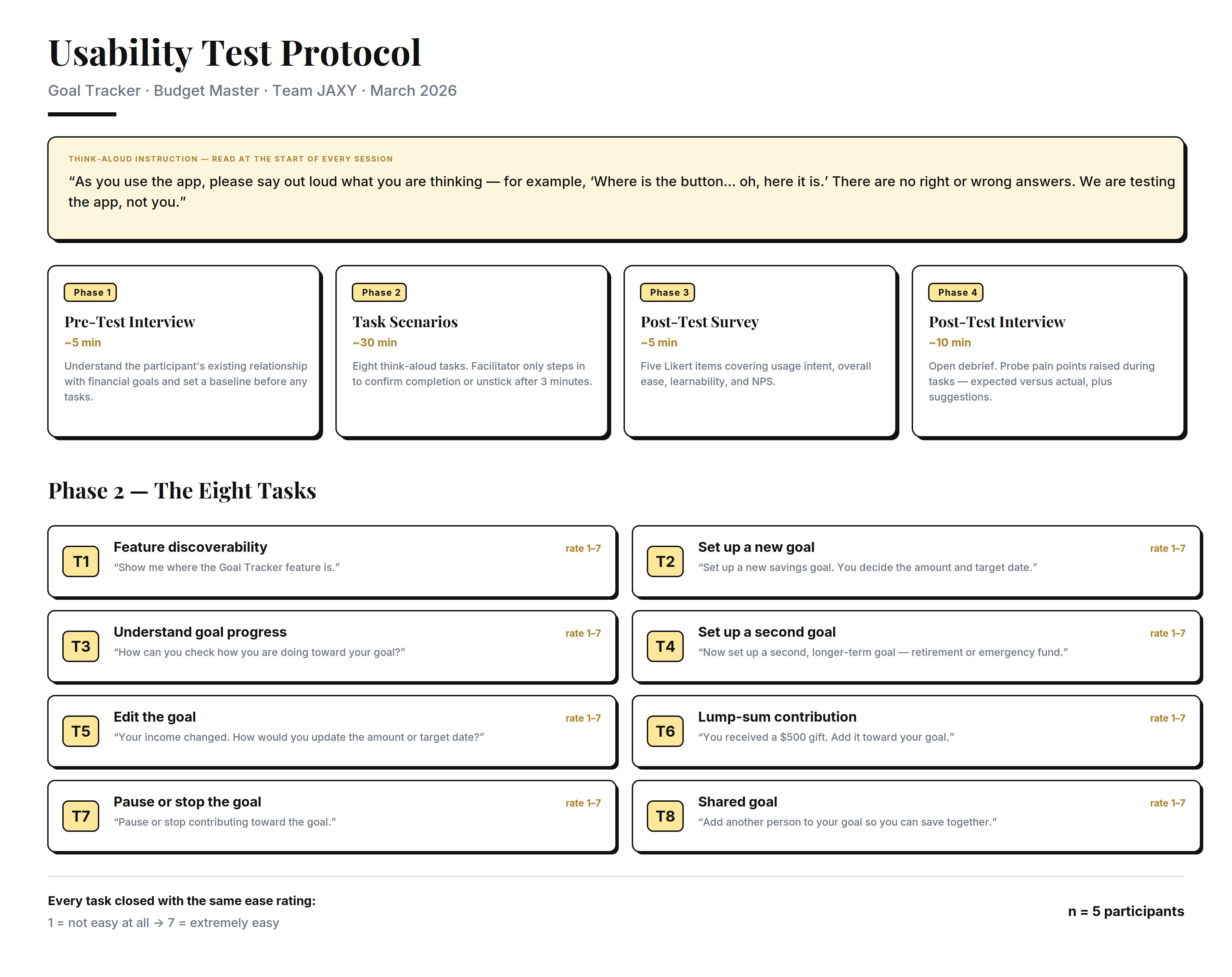
5 participants completed 8 core tasks using a think-aloud protocol via Discuss.io. Each session followed a 4-phase structure:
Pre-Test Interview
Explored participants' prior experience with Goal Tracker and expectations.
Task Scenarios
8 tasks with think-aloud protocol, each rated on a 1–7 ease scale.
Post-Test Survey
Five Likert-scale questions covering usage frequency, ease, and NPS.
Post-Test Interview
Open-ended debrief exploring confusion points and unmet expectations.
Recruitment Strategy
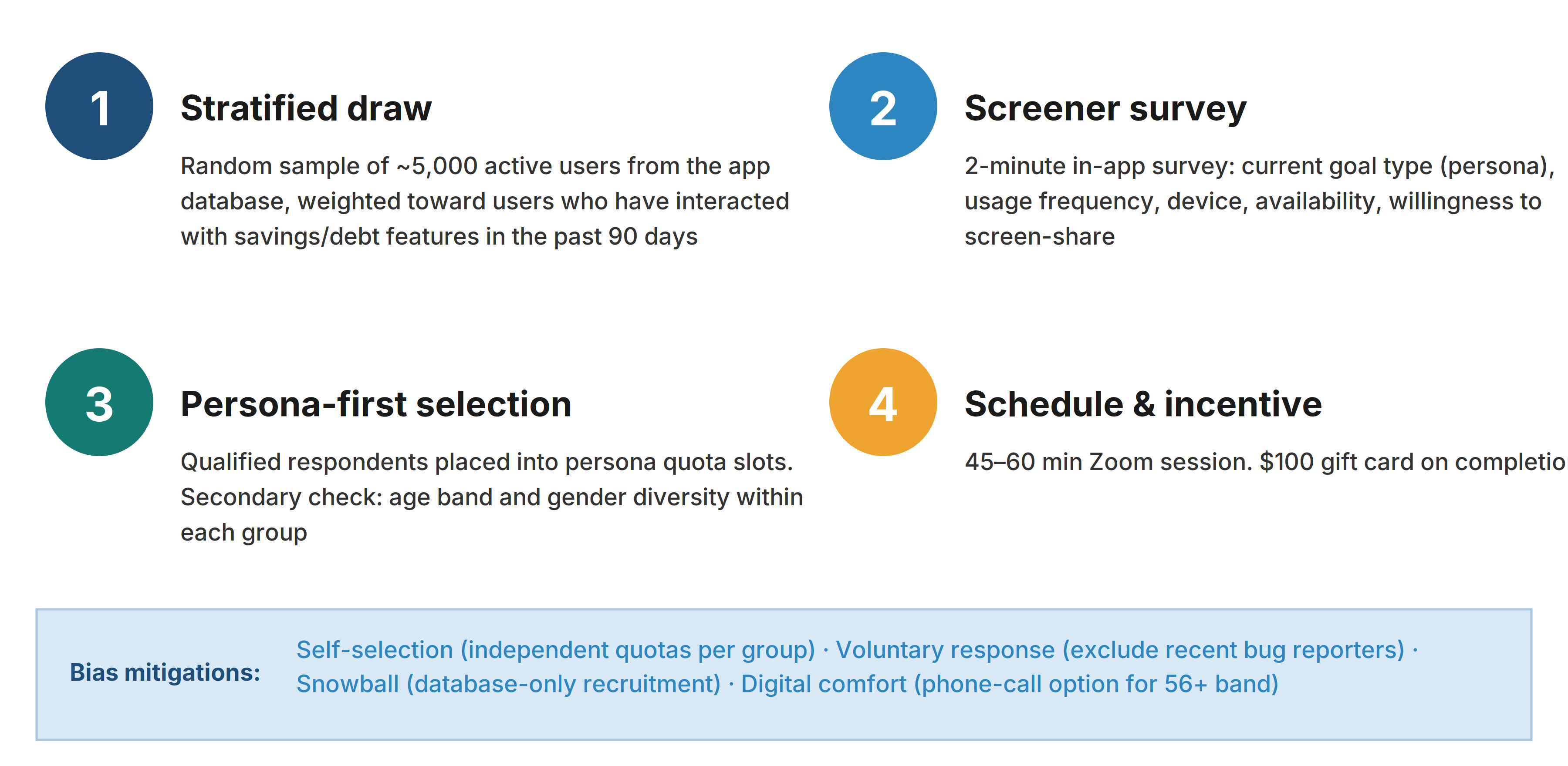
We ran a stratified recruitment plan built to reach each persona fairly.
- Sample: ~5,000 active users, weighted toward savings and debt feature users.
- Screener: A 2-minute in-app survey sorted respondents into persona-based quota slots, with secondary controls for age and gender.
- Sessions: 45–60 minute remote sessions with a $100 gift card incentive.
- Bias mitigations: Independent quotas per group, exclusion of recent bug reporters, database-only recruitment, and a phone-call option for the 56+ age band.
Critical Product Question
Why can't users find, create, or edit a simple savings goal?
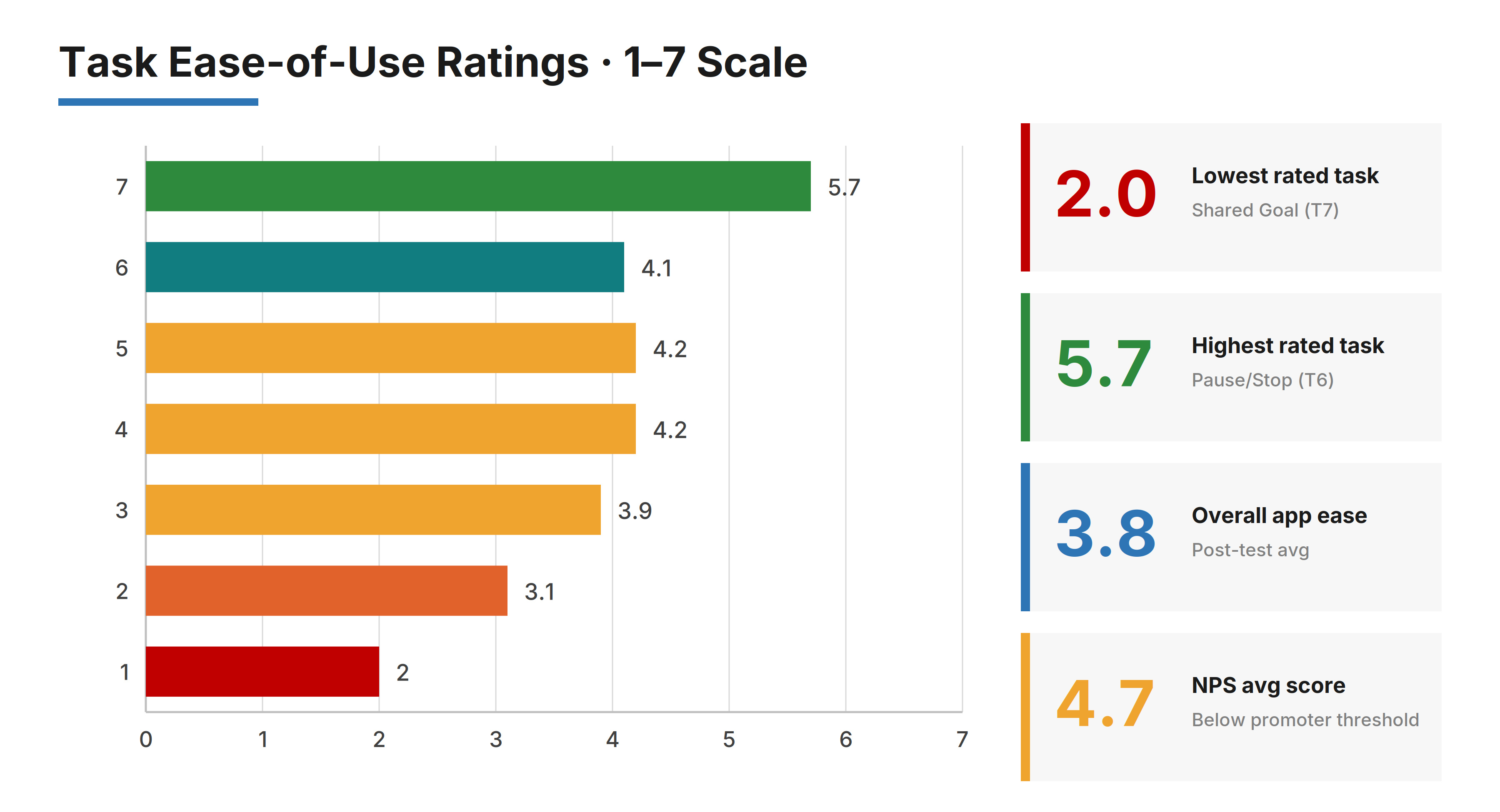
2.0/7
Lowest: Shared Goal setup
3.8/7
Overall ease-of-use
5.7/7
Highest: Pause/Stop
4.7
NPS average
Key Findings
High Priority
Goal Tracker is not discoverable
Buried at the bottom of the home screen, below the fold. Multiple participants mistook it for a promotional banner. Recommendation: promote to a dedicated navigation tab.
Goal setup requires too many prerequisites
Users had to link a bank sub-account and assign a budget category before entering any amount. The confirm button was greyed out with no explanation. Recommendation: let users enter goal amount and target date immediately.
"Target Amount" was consistently misread
Users read it as a monthly contribution target rather than the total goal. One participant set $500 instead of $18,000. Recommendation: rename to "Total Goal Amount" with microcopy.
Goal editing was hidden
No visible Edit button on the goal detail page. Only accessible via a long-press gesture no participant discovered. Recommendation: add a visible "Edit Goal" button.
Lower Priority
No direct path to log a contribution
General Income, Expense, and Transfer options did not update Goal Tracker. Recommended: add a prominent "Log Contribution" button inside the goal detail screen.
Debt payoff goals visualized like savings goals
Progress bar moved backward after a loan statement auto-synced, causing confusion. Recommended: distinct "shrinking balance" visualization for debt goals.
Shared goals required partner to independently change settings
Contributions couldn't be tracked until partner manually updated their own settings. Recommended: guided invite flow with a direct consent screen.
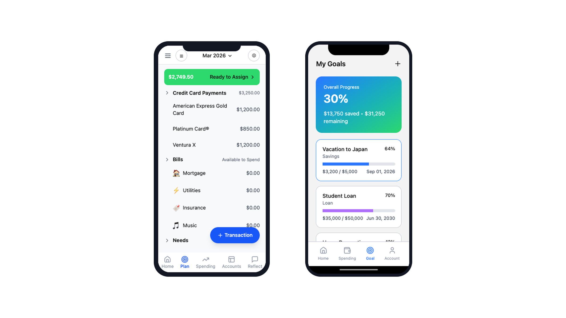
Design Shift — Redesigned Wireframes
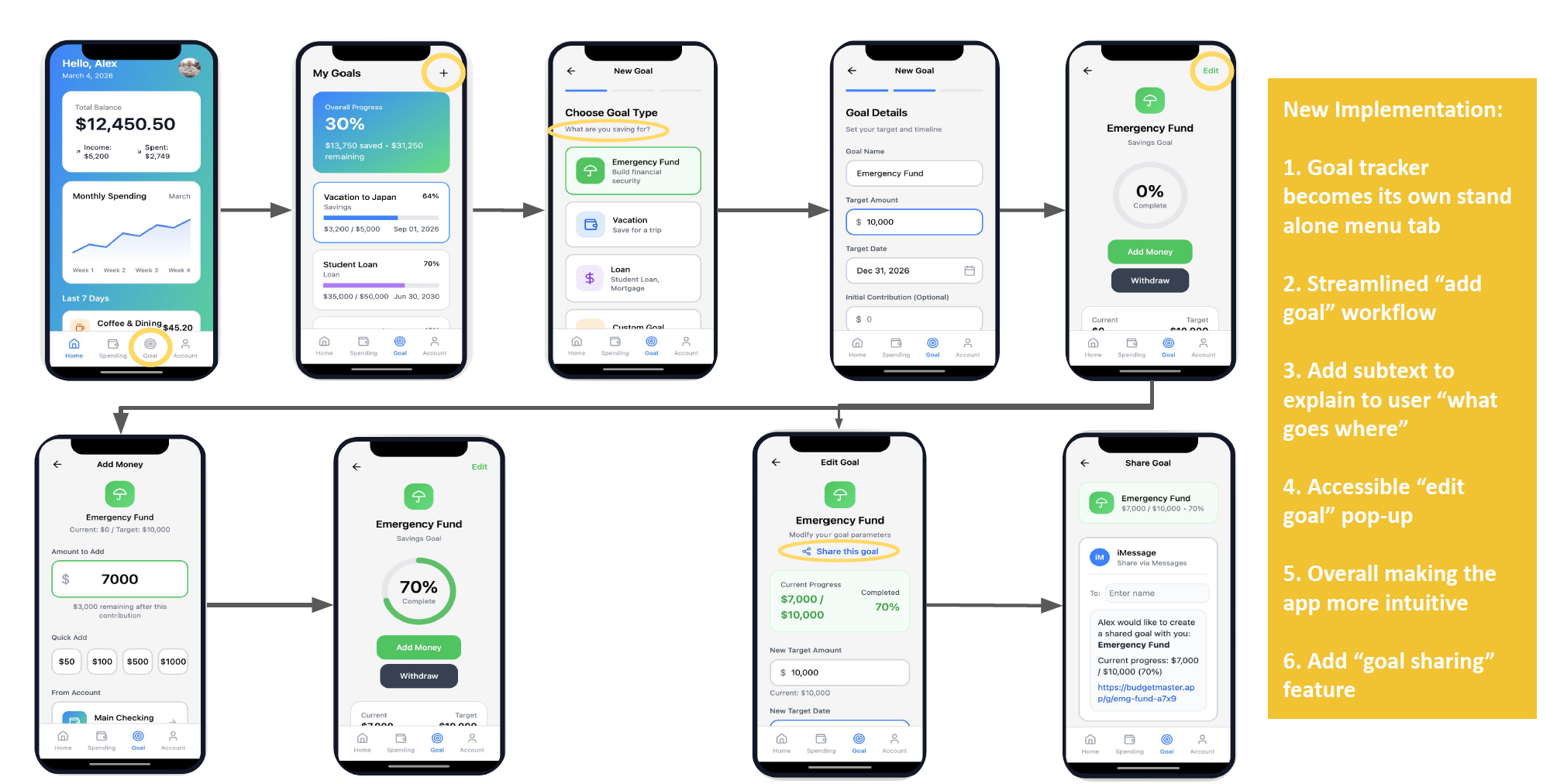
Standalone navigation tab
Goal Tracker elevated to its own dedicated tab at the same level as Transactions and Budgets.
Streamlined "Add Goal" workflow
Enter amount and date first, everything else optional. Reduced from 5+ steps to 2.
Descriptive subtext
Microcopy explaining what each field means, preventing the "Target Amount" misread.
Visible "Edit Goal" button
Prominent edit action on the goal detail screen, no hidden gestures.
In-context "Log Contribution" flow
Direct contribution logging from within the goal, no detour through general transactions.
Guided goal sharing
Invite flow with direct consent screen, eliminating the need for partners to independently configure settings.
Outcome
Before
2.0/7
Shared Goal ease
3.8/7
Overall ease
Hidden
Goal Tracker discoverability
5+ steps
To create a goal
After
Standalone tab
Always visible in navigation
2 steps
To create a goal
Visible edit
Prominent button on detail page
Guided sharing
One-tap invite flow
Reflection
Recruiting low-frequency segments taught me the most. Retirement savers were just 8% of our users, and reaching enough of them was harder than reaching any other group. That changed how I think about sampling — a plan has to account for how hard some groups are to reach, not just how many of them there are.
The personas mattered too, because we built them before the usability test instead of after. That let us design tasks around each group's real goals. So our findings weren't "users had trouble with X" — they were "wedding savers had trouble with X because of Y, while debt payers hit a different wall for a different reason."
Thanks for reading!