The Watch Doesn't See What You Actually Did
A Qualitative Analysis of the Apple Watch Fitness App
Role
Lead Researcher
Skills
Contextual Inquiry, Semi-Structured Interviews, Qualitative Analysis
Timeline
2023
Context
Academic research, Indiana University Bloomington
Overview
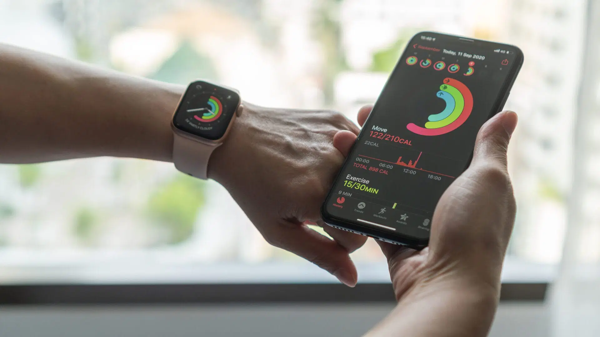
The Apple Watch Fitness ecosystem is built for solo, steady-state exercise. I ran contextual inquiry and semi-structured interviews with three users across expert, moderate, and intermittent engagement levels.
The problem isn't accuracy. It's that the algorithm assumes a constant solo pace. Real exercise happens with partners, pets, and interruptions. When the watch can't see what a user actually did, the data stops being trustworthy.
Three participants is small — the goal was depth on how each engagement level breaks down, not prevalence.
Project Overview
Objective
To uncover the frustrations and emotions that guide user behaviors within the Apple Watch Fitness ecosystem (watchOS and iOS).
Target Audience
A focused study on Apple Watch users in Bloomington, IN, who utilize the device specifically for fitness tracking.
Key Question
How do design limitations and algorithmic rigidity affect user motivation and the perceived accuracy of their fitness data?
A Dual-Pronged Approach
Contextual Inquiry
01 — Observation
- • 10-minute observations during actual exercise
- • 5–10 minutes of app navigation observation
- • Goal: Gather reliable data on actual user behavior in its natural context
Semi-Structured Interviews
02 — Interviews
- • 20-minute sessions per participant
- • Focused on past frustrations and context behind usage habits
- • Goal: Cross-reference observed behaviors with self-reported experiences
Meet the Users
SH L.
38, Female. Uses watch daily for Walking, Yoga, and Skateboarding. Deeply engaged with fitness tracking features.
YJ Y.
32, Male. Uses watch ~5 days/week for Badminton and Basketball. Moderate engagement, some frustrations.
R P.
54, Male. Uses watch ~3 days/week, often passively, for Running and Cycling. Least engaged with app features.
The 'Ghost' Workout
The Apple Watch frequently fails to detect the start and stop of non-running activities, creating significant data gaps. Yoga sessions, strength training, and non-standard workouts are particularly affected. Users complete full exercise sessions only to find no record exists — their effort becomes invisible.
When the watch misses a workout, users stop trusting the data it does collect.
“My watch can't recognize my yoga activity... I somehow felt sad when I didn't get those records.”
— SH L.
Social & Environmental Friction
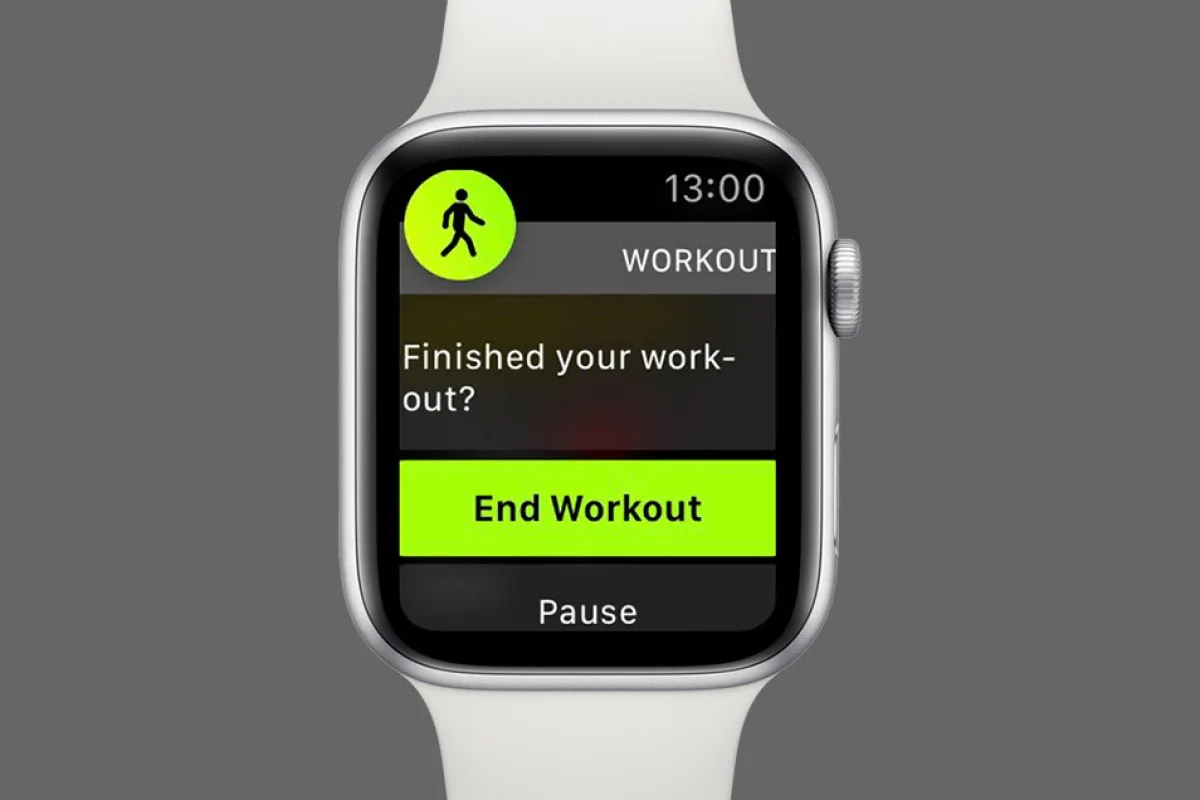
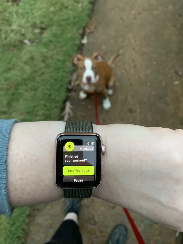
The watch penalizes exercise that happens with other people. It assumes a constant, individual pace, and interrupts when users slow down for partners, pets, or safety.
- Walking a pet: Slowing down triggers constant "Finished?" prompts.
- Contact sports: Users remove the watch for safety and lose all data.
The fitness algorithm optimizes for solo, steady-state exercise — but real fitness happens in messy, social, unpredictable contexts.
“My watch kept asking me 'did you finish?'... It's just because of my dog! He is old!!”
— R P.
The 'Cooldown' Gap & Navigation Friction
UI Issues
Clumsy UI Workflow
'Dismiss' button is hidden below the fold. Users accidentally hit 'End Workout' when they intended to dismiss a notification, prematurely ending their session.
No Seamless Transitions
Users must manually end a workout, save it, then start a new 'Cooldown' workout. There is no one-tap transition from active exercise to cooldown.
Confusing Architecture
The information architecture assumes users will browse and explore. But on a tiny watch screen, discoverability depends on hierarchy, not exploration — so features stay invisible.
- Long alphabetical lists: A cluttered hierarchy hides the specific activities users want.
- Opaque badge criteria: Users don't understand how to earn achievements or what they mean.
“I didn't figure out they also have badminton... I thought they should be in my phone app.”
— YJ Y.
Design Recommendations
Social / Pet Mode
A toggle to reduce auto-pause sensitivity and suppress 'Finished?' notifications when the user's pace naturally varies due to companions, pets, or environment.
Seamless Transitions
A 'Start Cooldown' button directly on the active workout screen, eliminating the need to end → save → start a new session.
Hierarchy Control
A 'Favorites' list on iPhone that syncs to the top of the watch workout list, putting frequently-used activities one tap away.
Core Insight
The study reveals a disconnect between powerful hardware and rigid software. Algorithms struggle with the unpredictable rhythms of human life.
To keep users, the app needs to adapt to how people actually exercise.
Outcome
Before
Constant "Finished?" prompts
When pace varies for pets or partners
End → save → restart
To log a cooldown after a workout
Long alphabetical list
On a tiny screen
After
Social / Pet Mode
One toggle to suppress false prompts
"Start Cooldown"
Directly on the active workout screen
Favorites list
Synced from iPhone to the top
Reflection
Quantitative data would have shown engagement metrics; only qualitative research could reveal the emotional texture of why users engage the way they do — and why some quietly walk away. The most important UX insights often live in the gap between what a product assumes about its users and what those users actually do. Every workaround a user invents is an unmet design need.
Thanks for reading!